

University Health Services App Design
Accessing university healthcare can be stressful and time-sensitive, especially for students navigating appointments, records, and services for the first time. The MyUHS app is a conceptual mobile prototype designed to explore how a mobile-first healthcare experience could improve accessibility, clarity, and user trust for a large, diverse student population.
WORK
University Health Services app redesign
ROLE
Project Lead, UX Designer, Team of 5
TOOLS USED
Figma, Figjam, Adobe Illustrator
TIMELINE
3 Months
Problem
The existing UT Austin health services system was web-only, making it difficult for students to:
Schedule appointments efficiently
Access their health information quickly
Navigate complex services under stress or time pressure
Goals
RESEARCH AND INTERVIEWS
We wanted to gather specific information about UT students and healthcare professionals preferences, interests, constraints, and other relevant factors related to MyUHS.
ACCESSIBILITY AND NAVIGATION
Based on the feedback we received, we wanted to create an accessible app that’s easy for students to navigate and use on the go.
DESIGN AND IMPLEMENTATION
We wanted to create our designs to eventually be implemented and make a positive impact on students in the future.
Research Approach
Through interviews with healthcare professionals and UT Austin students, We gathered detailed and in-depth information about interviewee’s personal experience with MyUHS.
Analyzed existing UHS website flows for friction points
Reviewed healthcare accessibility standards
Modeled common student healthcare scenarios when using the app
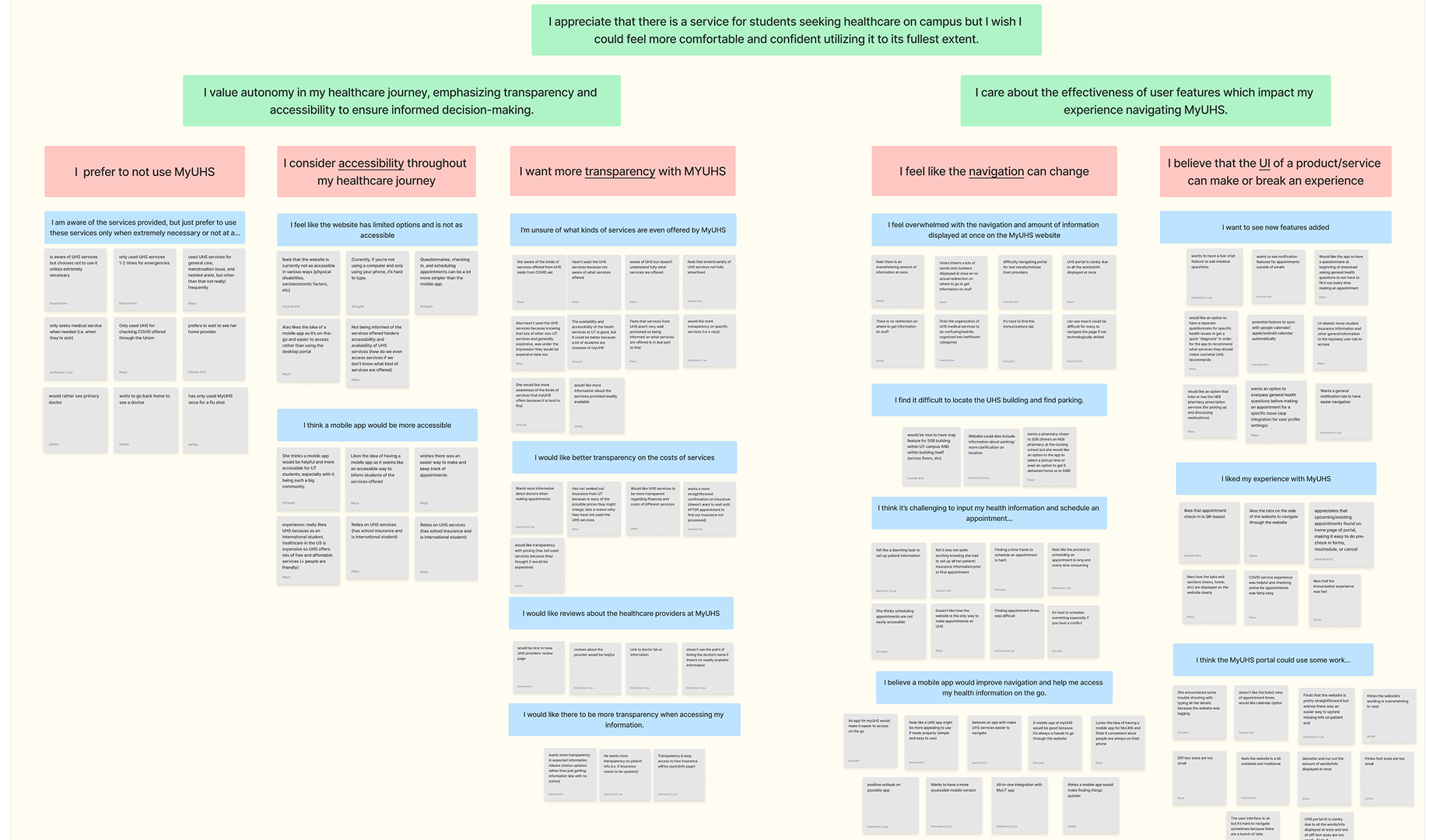
Student Interview Feedback
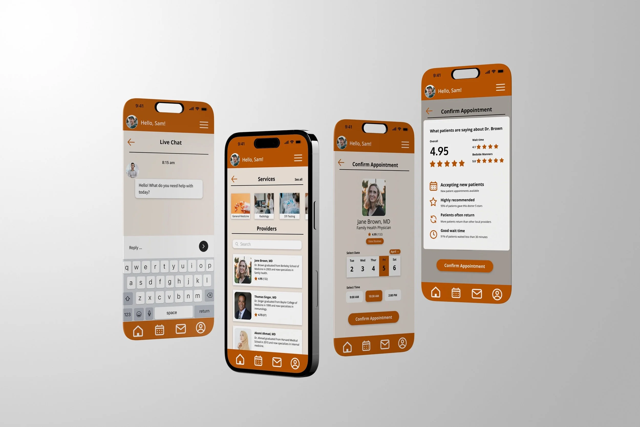
DESKTOP TO MOBILE CONVERSION
Students must utilize a web browser to access MyUHS which takes longer compared to a mobile application that offers easy access.
INFORMATION OVERLOAD
Students feel too overwhelmed to navigate the site in full due to all the information being displayed at once, turning them away from using the services.
LIMITED OPTIONS
There are limited options to schedule appointments or track health. There are also limited options to see your healthcare provider or get in touch with professionals on the go.
Healthcare Professional Interview Feedback
PROMOTION OF SERVICES
By including notifications, service information, and being transparent with the cost, students are more likely to use the services.
USER INTERFACE CHANGES
The healthcare professionals believe there should be improvement on the User Interface by making it more intuitive.
SAFETY FEATURES
The app can be made secure by adding EID log-in, including a time out option, and having a disclaimer to show that the information is protected.
Interview Takeaways
Healthcare for students should be easy to access and navigate. Having the MyUHS app will make scheduling appointments and looking at test results much easier.
Personalized features based on individual health needs will make students more comfortable with seeking healthcare at the university.
Solutions
HEIRARCHY
We can emphasize the important information such as booking appointments, checking in, and highlighting the important information.
NAVIGATION
Adding buttons and icons can help with navigation to different sections and help create appointments easier.
TRUSTWORTHINESS
We can increase trustworthiness by making the app user-friendly, secure, and modern, similar to common apps that student age groups use.
ACCESSIBILITY
Creating Text-to-audio and text size, making the app accessible for visually and audibly impaired. Stretch goal, not included in prototype.
COMMUNICATION
We can add a messaging system to easily contact your healthcare provider and displaying easy-to-access emergency numbers.
VISUALIZATION
Adding graphics, notifications, and buttons to help users understand the data so the text is not overwhelming for the user.
Design Consistency
Throughout this project, I became familiar with user research, concept generation, and design methodologies such as sketching, story boarding, wire framing, prototyping, and more. In addition, I learned how to collaborate in a team setting, communicate design rationales, and present compelling narratives about my work.
Continued Learning
I learn from past projects and am always trying to develop my skills. Despite this project being a conceptual prototype, we learned from real individuals and it would be amazing if they implemented this design to the existing product. I would love to continue my journey as a UX designer and learn more about creating accessible and interactive experiences!